Examine was started back in 2011. Since then, we’ve had tens of millions of visitors. We’ve built up a reputation of trust and authority and an irritating adherence to being nuanced and contextual, rarely ever giving you binary answers.
We started work on Examine v2 back in January 2020, and we’re aiming to release it to the public on July 6 (47 days from today).
I asked via email and social media if people wanted me to write about the experience, and I got 50+ emails and messages on what people wanted to learn.
From talking to people, I generated an outline:
- What is v2?
- Customer research and the resetting of our expectations
- Why v2?
- RFP for design
- Growing up operationally
- Simultaneously running the site and preparing for the future
- How did we organize 10,000 moving parts?
- What does the future portend?
My tentative plan is every Friday, I will add a section from the above outline, and in 10 weeks, we’ll have a massive document that tells you about the entire experience.
A few quick disclaimers: many things happened in parallel, and we started this before COVID exploded, so my memory may be fuzzy on some details. This is all from my perspective – Kamal dealt with the research side of things, and his experience is likely a bit different.
Finally, if you want to make sure you don’t miss updates, add your email:
What is v2?
Examine spawned out of /r/fitness as I grew frustrated by people asking the same question over and over without bothering to search if the question had been asked.
I’d see people spend enormous energy answering something basic like “should I take creatine?” only to see the question again 3 days later.
So it made sense to me: why don’t we build a website where we can answer these questions entirely and just link to it whenever someone asked?
A simple solution to an irritating problem.
Since we were just bros trying to get muscular, Examine initially focused on bodybuilding supplements. As we grew, our scope expanded into fitness supplements. Then general health supplements. We eventually expanded beyond supplements to include foods, diets, and lifestyle interventions.
More recently, we’ve expanded our coverage to more esoteric topics such as binaural beats and menstrual cups.
Note that neither of these are supplements. Expanding past supplements and covering a considerable number of indications was getting to be daunting. So we needed to take a step back and ask ourselves two critical questions:
- How do we organize health information?
- How do people look up health information?
I’ll answer #2 next week.
(I want to reiterate that much of this happened in parallel – a lot of this came from our Customer Research, which I will dive into next week).
For the first question, we decided to take a step back and abstract the two main sections of information on our site:
The first one was easy – a supplement is basically a specific type of intervention usually taken orally, can be purchased without a prescription, and can impact your health. Walking is an intervention. Sex is an intervention. Medication is an intervention. Playing with your grandkids is an intervention.
So abstracted out, supplements became one of several types of interventions. Under the umbrella of “interventions,” we ended up with a few obvious ones we cover:
- Supplements
- Diets (keto, Low-FODMAP)
- Foods (garlic, blueberries)
- Misc (the aforementioned binaural beats, menstrual cups)
This level of abstraction means that if we want to expand into exercise – we can. If we want to expand into medication – we can!
We can add and organize anything by treating the inputs that impact your health as an intervention.
The second side is the outputs, aka our health topics. And this is where things started getting messy.
Looking at other sites, pretty much nobody had created any form of hierarchal organization – similar to us, they just vomited out 500+ links and said, “okay good luck finding this out!”
We tried to look at it systematically – how would we organize health topics in a way that links them to each other but also lets us add a layer of “this is what most people care about.”
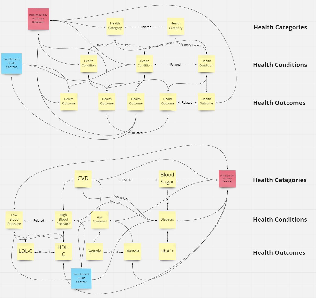
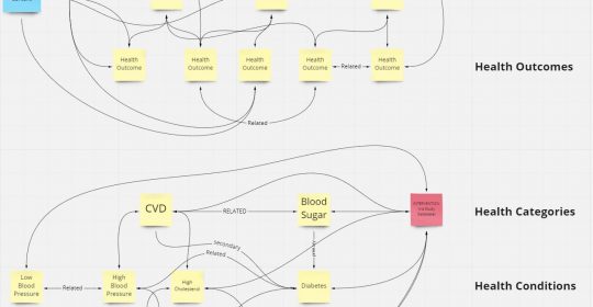
We ended up with three levels of hierarchy:
- Health categories
- Health conditions
- Health outcomes
Examples to illustrate the structure:
- Category: Cardiovascular
- Conditions: High blood pressure, High cholesterol
- Outcomes: Blood pressure, LDL-C, HDL-C
Most people are looking for conditions, whereas outcomes are the nitty-gritty details to track, with the categories being the umbrella term for a collection of conditions.
The beauty of this is there is no strict 1:1 relationship – any condition can be under multiple categories, and any outcome can be under any condition.
Here’s an example of it all interconnecting (click):
In-between all of this is our Study Database (aka HEM right now).
The Study Database is the brain – all studies go in there and then propagate to the rest of the site’s pages. Instead of manually tracking and updating multiple pages, it’s all in one place.
How it looks organized (click):
This subsequently makes updating our pages easier (and faster) as new research comes in.
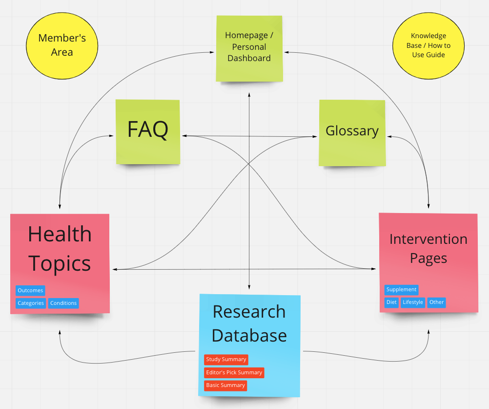
So what does v2 look like for a user?
(Bear in mind that a fair amount of this came from the customer research part, which I’ll cover next week).
A user comes to our site and can look up any health topic they are interested in.
At the top of the page, they’ll find a quick overview of the health topic and then see answers to the most frequently asked question – what it is, what causes it, etc.
Next, they’ll find our Study Database (the Human Effect Matrix on the current site), which summarizes the research to know what interventions have what impacts.
Over time, we’ll expand the Study Database and merge our Supplement Guides into them, so the user can quickly look up more detailed information where it is available.
After the Study Database are the Study Summaries, which summarize the latest research on the health topic you are interested in.
And then finally – the more niche frequently asked questions.
And they can do all of this without worrying about us trying to sensationalize or split the page up into multiple pages to generate pageviews (to generate more ad revenue).
No hype; just context and nuance, backed by evidence.
That’s it. That’s v2 – an easy-to-use reference that gives you the information you are looking for, all in one place.
(I posted a preview gif on LinkedIn if you are curious to see it in action)
Before we could make these decisions, we had to understand what our customers wanted. What were they looking for? Why were they looking for it? What outcomes did they want from our site?
I’ll cover that next week: Customer research that reset our expectations.
Customer research: understanding why customers hire us
Many years ago, I was lucky enough to meet John Berardi and Phil Caravaggio, co-founders of Precision Nutrition. These guys bootstrapped their company and sold it for over $200,000,000 (Phil was also partially behind the publication of Ray Dalio’s Principles).

When talking to Phil, he often said that JTBD was one of the most important things they ever did as a company.
What is JTBD?
JTBD is short for Jobs-to-be-Done. I’ve written about it a bit more under A business has one job: to solve a problem; the essence is that catering to demographics isn’t nearly as relevant as helping solve the specific job your customer wants to solve.
(You may have heard of the infamous McDonald’s milkshake JTBD).
In 2019, we had two subscription products: Examine Legacy (formerly Examine Plus, which unlocked access to our Study Database) and the Nutrition Examine Research Digest (NERD).
Examine Legacy was the more popular one, netting us hundreds of customers every month.
Around this time, Phil hosted a private seminar with Bob Moesta, who explained the JTBD process and did a live interview.
Between Phil’s exuberant recommendation and seeing Bob in action, I got right to it; we started interviewing our Examine Legacy customers, trying to understand what they really were looking to solve.
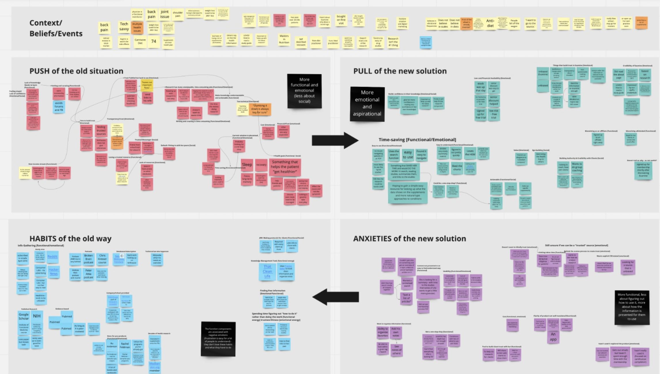
The process of interviews and analysis
The process was simple:
- Identify someone who recently purchased Examine Legacy. It had to be the right balance of “they’ve had enough time to use it” and “it’s still recent enough that they can recall their motivations.”
- Have me get on a call with them. We’d have a few other employees join in on the phone call (which we disclosed), and their job was to listen and come up with potential follow-up questions.
- Talk to them to understand what led them to Examine and what led them to sign up. What were the issues they were facing? How did they discover us? Who are they as people?
- Dig – we didn’t want superficial answers, and we also were mindful that people were trying to help us and give us the answers they thought we wanted to hear! My job was to fully unpack things – “Elaborate on this” “What do you mean by that?” “How would that look to you?” “When you say X, can you break it down?”
- After each interview, debrief with the team to try to identify the themes of:
- Push – what is pushing them away from their current way of doing things (their current solution)?
- Pull – what is pulling them toward us as their solution?
- Habits – what habits have they already built, and how does that inertia impact things?
- Anxiety – what are they worried about if they make the switch?
- We wanted to identify the themes and note their emotions – what got them excited? What made them perk up? What bummed them out?
Our goal was not user experience (though it did come up) – our goal was to understand their motivations and problems so we could solve those. UI and UX were secondary concerns.
Once we had 5-10+ interviews, we could then group them by similarity. Then we started asking ourselves: what common themes emerged, and what did we learn from them?
This was not an easy-breezy process.
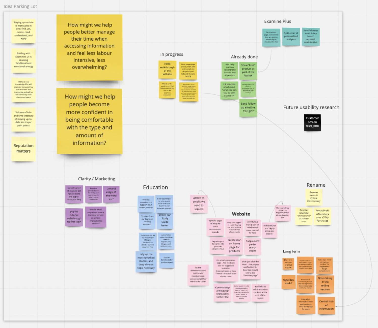
Each interview was about 45-60 minutes. We would then take a 10-minute break and then spend an hour organizing our notes and discussing themes and moments and comments of interest in each interview.
We used miro to organize our information, and here are a few pictures of our work:
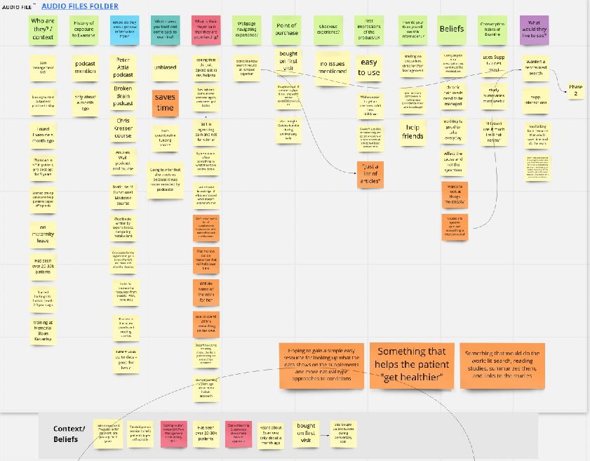
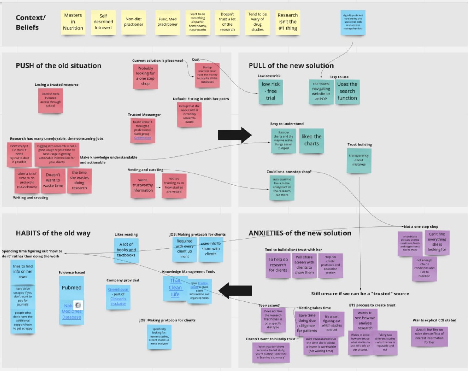
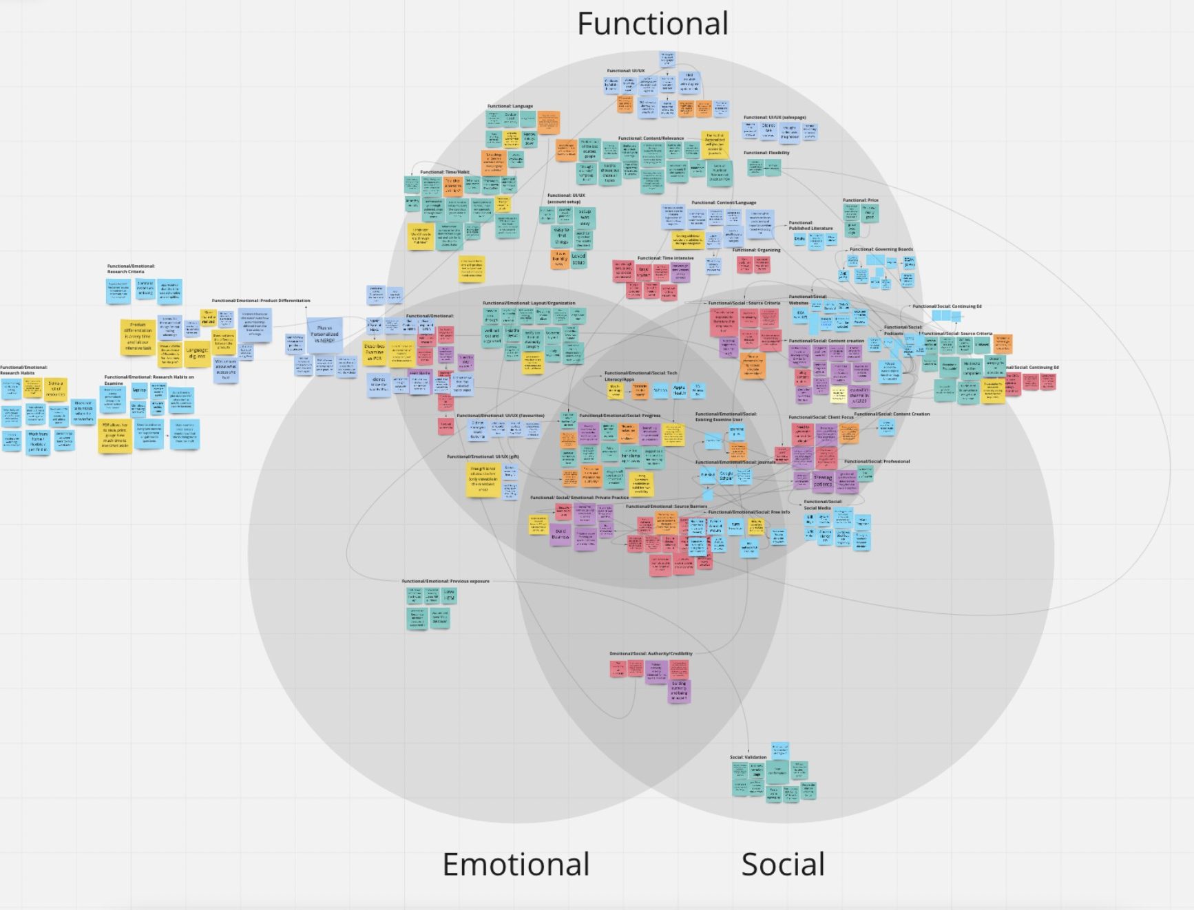
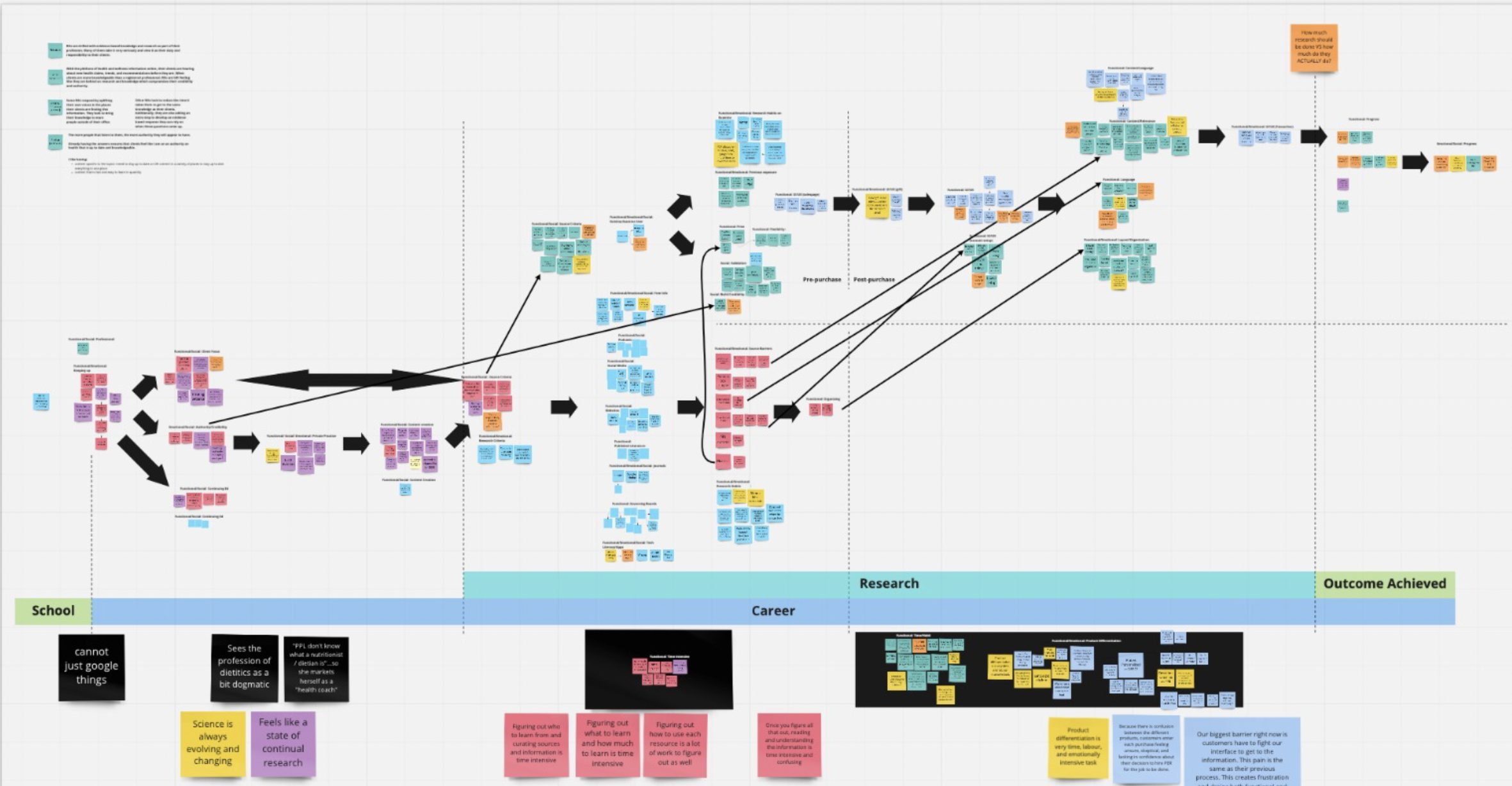
The end goal was to understand what our customers were looking for and how we could best give them what they wanted.
Via these interviews, we came to some significant realizations (which collectively led to Examine v2).
A lot of people have chronic conditions and are on medication
One of my incorrect assumptions was that people were interested in supplementation because of a health issue and didn’t want to take medication.
Wrong! (but also not wrong).
Wrong, because a lot of people were already on medication.
Not wrong, because what was happening was medication A would cause side-effect X. Then they would take medication B to deal with side-effect X, but that would then cause side-effect Y.
People were looking for supplements to help alleviate side effects, not solve their primary chronic issue.
When we talked to people, they rarely ever spoke about supplement X or supplement Y. Instead, they would talk about how they had issues with their kidney, how their liver was not working optimally, how they had problems going to the toilet, and so forth.
This led to a straightforward realization:
Most people do not care about supplements – they care about their immediate health conditions.
(This seems so duh in retrospect).
We are a company whose mission is to help you be healthier via research. And if we wanted to help people be healthier, we had to focus on what they focused on: health conditions.
While our site was geared towards supplementation, it needed to be geared towards the health conditions people suffer from.
Supplements may have been our basic “atomic” unit, but we needed to change that to conditions.
As I mentioned in the earlier “What is Examine v2?” section, this is one of our fundamental changes: we made health conditions the focus, with everything else (interventions, FAQs, Study Database, etc) stemming from health conditions.
People have questions, and they want answers
This was our second main realization; again, it seems obvious in hindsight, but whew did we fail here.
From day 1, Examine was built as a repository of information – we dug into the research, crunched it, and then threw it all up online for you to read this overwhelming mass of text.
(aka our Research Breakdown sections).
We soon realized that the Research Breakdown section, while looking impressive, was not very useful. Less than 5% of people ever read it, and I doubt even 1% in total came away with anything useful.
In reality, people learn about health by asking questions; most do not really care about the mechanisms or nerdy details.
If I mention a supplement like ashwagandha, the first thought most people have is “what is ashwagandha?” followed by “what does it do?” and so forth.
People learn by asking questions.
So the subsequent realization:
Drop the Research Breakdown as a monolith and instead spread it across Frequently Asked Questions
We are not a textbook company. People coming to us are not sitting down to read a wall of text to understand everything they can.
As I mentioned, we are a company whose mission is to help you be healthier via research. And if that is our goal, we should talk to you how you would like: by answering your questions (except, unlike most others, we have the references to back up our answers).
Thus, Examine v2 will feature a set of generic FAQs that apply to most health topics and supplements and then a host of esoteric questions that are unique per individual topic or supplement.
For example: does creatine lead to hair loss? Is a migraine dangerous? What causes IBS? What is the connection between diet and high cholesterol?
Answering the questions people ask.
I also want to be super clear – this is not dumbing it down. This is meeting your users where they are – don’t throw a soup of knowledge at them, spoon feed them answers to the questions they care about.
Give people the information they care about
The Nutrition Examine Research Digest (NERD) was a beast. Every month we’d break down 6-10 studies, and each analysis would be 5-10 pages long.
We thought it was awesome, but talking to users, we realized while it was impressive, it was overwhelming!
It was akin to having an 800lb deadlift – very impressive, but honestly, most people don’t care.
Earlier, when I talked about a lot of people have chronic conditions and are on medication, there was a related realization:
Many people only care about the health conditions that are immediately impacting them
There are a bunch of knowledge collectors out there who want to learn everything they can. But for most people, their existing health conditions are a significant enough headache that they don’t have the energy to care about other things.
Someone with diabetes will prioritize learning about blood sugar but often won’t spend a lot of energy on other topics (such as memory, bone health, libido, etc). They have more pressing concerns!
And since NERD covered the gamut, for most people, only 1 or 2 articles every month were of interest (if even). The others were just way too long – it wasn’t a quick read; it was an investment of time!
People would say they loved the idea, but when it came to the reality of reading it, they would balk – this isn’t pleasure reading, it was intense learning!
(This is related to what I said during The Process of Interviews and Analysis – people will try to be helpful, but they won’t tell you the complete truth).
And that was our subsequent realization:
Give people the ability to go deep on the topics they want.
This is where our categorization started coming into play. How can we give users precisely what they want? How can we give them study summaries without overwhelming them?
So we created an overarching set of categories (25) and vastly simplified our summary format to only hit the essential points:
- Background
- The study
- The results
- Notes
Instead of 5-10 pages, each concise study summary was roughly one page: perfect, so our users would not be overwhelmed.
In July 2020, we released our Study Summaries subscription – 150+ studies summarized across 25 categories every month.
It was by far our biggest hit, and these Study Summaries saved Examine as a business (a story for another day, but one I’ll quickly touch on next week).
Giving people the ability to choose which categories they wanted to follow was critical. Instead of having 1-2 relevant studies every month, since each category had at least five studies, you always had some interesting new research to learn about every month.
Related, we will offer a “Lite” membership that will let you subscribe to a singular category. This enables you to go as deep as you want without feeling like you are overpaying for the information you don’t care about.
Confusing subscriptions
So now we had Examine Legacy (access to our Study Database), Study Summaries (150+ studies summarized a month), and NERD (6-8 super in-depth articles on studies).
We kept hearing from our users that they were confused when they signed up – which should they pick? What exactly was the difference? Did they want NERD? Was NERD for pros?
Talking to our customers, this came up consistently: “I did not know the difference, and I tried to understand, but it made no sense.”
Our customers as an emoji: 🥴
I’m a big believer in analysis paralysis. KISS.
I’m even willing to sacrifice 10-15% of revenue because KISS doesn’t just make it easier for the customers; it makes it easier for us – less complexity makes customer success easier.
Our customers were already bewildered by the overwhelming amount of information we presented them, and now they had to figure out what subscription was right for them?
So our subsequent realization:
Simplify our product offerings
Initially, we stopped selling Examine Legacy. And six months later (for our 10th anniversary), we merged Study Summaries and NERD into one Unified Membership.
Instead of having three options at $5/mo, $9/mo, and $29/mo, we just put them all together at $29/mo.
Signups and LTV went up – customers knew that they unlocked an insane amount of information once they signed up.
Now, I previously mentioned we had a Lite membership, which will bring back a level of complexity. But it will do it on the level that a user understands – you get access to all of our content or just one category. Much simpler.
You always get depth (as people want), but you get to choose the level of breadth you care about.
It’s hard for me to find the information I need
This really will be covered in the next section (Why v2) next Friday, but I wanted to bring up a pain we also heard when talking to customers:
“Why is your information across so many pages?”
Right now, Examine has seven different pages on testosterone. If a person wants to look up information on testosterone, they need to read all seven pages to get the whole picture.
That sucks.
Not only that, we have three different search engines – one for the site, one for Study Summaries, and one for NERD.
(Why? I will explain next week!)
And so a simple realization:
Have all the information on a topic accessible in one place.
This seems small but significant: how do we do that without overwhelming the user with how interconnected health information is? How do we even deal with information internally, so we don’t have to update multiple areas if a new study is added?
Next week, I’ll cover this more in the next section, but it was a crucial insight and a big part of why we had to create Examine v2 from scratch.
Give people the information they want
These insights came from talking to our customers – from digging into what they were genuinely looking for. And fundamentally, we were doing a terrible job solving the problems people were coming to us for.
There was a simple truth in all of this: supplements are nice, research is news, evidence is nice, collating all the research is nice, but it’s all meaningless if we don’t give it to them in a way that helps them solve their problem.
It did not matter if our information was the best or the most in-depth or nuanced or anything like that if the user could not extract useful information from our content.
And that’s what customer research helped us do – understand how we were failing our customers and help us figure out how we could do better.
So why v2? Why not just make incremental changes (after all, we did release Study Summaries after we Jan 2020)?
Why Examine v2?
Our customer research established that we had to improve the site in every single facet – information architecture, design, usability, and more.
So why re-do everything and not just try to improve things?
Examine struggles
In the mid-2010s, Examine was riding high – we had a sterling reputation, Google was sending us boatloads of traffic, and our site was growing. Things were looking good!
And then things went awry.
Our first significant misstep was performing superficial customer research. Instead of doing a proper deep dive, we asked what people wanted.
People wanted to know more about protein, so we created a protein guide!
People talked about the ketogenic diet, so we decided to create a keto guide!

An enormous oversight was we didn’t ask ourselves: why people were talking about keto?
It wasn’t the “science” behind it – it was a buzz on how it was going to be easy and you were going to shed a lot of fat and the opposite sex would find you insanely attractive.
We don’t do trendy; we do nerdy!
We were too broad with scope internally, so the writing dragged on and got overly complicated.
When we finally did push it out, the Whey Protein Guide did very poorly. The Keto Guide did poorly. We lost a fair amount of money.
Around the same time, Google started to tackle the vast amount of misinformation on the Internet and significantly decreased the amount of traffic they were sending us.
This culminated in us getting wiped out in 2019, losing roughly 90% of our traffic from Google (the infamous YMYL update for those who follow SEO).
So now we had nothing new to sell, had a lot less traffic, and were floundering.
We lost a fair amount of money in 2018-2019, and I had to pull a significant chunk of change from my bank account to keep it going.
We put ourselves into a bad spot.
Improving our finances
It was only near the end of 2019 that we made the right move: subscription.
The very nature of our work (constantly looking up the latest research) meant that having a subscription service made sense. I feel most sites kind of force a subscription, but ours was self-evident.
Going subscription also initially hurt (in the short-term, the subscription price is lower than the one-time cost), but after about five months, it started generating more revenue.
It took over a year after that for us to have built up any cash reserves to feel comfortable expanding the team.
I also want to take a moment to note that people tend to overestimate Examine’s revenue. Last month I asked a few dozen friends how much revenue they thought Examine made. Every person overestimated by a minimum of 100%, with the average person off by ~200%.
The combination of the vast amounts of free content (over 5 million words) combined with our horrific site structure meant that many users did not even realize there was paid content or even what it was.
The current site had no plan
When we started Examine back in 2011, we had no grand plans of tackling health information. We were just tired of people on /r/fitness posting the same damn question repeatedly, and we just wanted to quickly answer with a link and tell them “read this.”
Once we got going, we realized there was a demand for this kind of information.
So we expanded from bodybuilding supplements to fitness supplements.
Then from fitness supplements to all supplements.
Then from supplementation to nutrition and health.
We now even cover more esoteric topics such as menstrual cups and binaural beats.
This expansion was not intelligently designed – a completely ad-hoc development with no grand plan.
For example, the original site was all programmed under “Supplements.” Both menstrual cups and binaural beats are still classified under “Supplements.”
We launched NERD back in 2014, but it took us over five years to convert it from a monthly PDF to a web-based system because our backend was a mess.
It gets worse – the current site has three separate search engines! One is for the main site content, another is only for Deep Dives (formerly NERD), and a third is for our Study Summaries. And yet you still cannot search through our Supplement Guides.
There was no thoughtful design for making everything elegantly work together – we were just so busy trying to keep things going that things got smashed together.
Hell, our Study Summaries are the main attraction of our subscription, and you’d have no idea it even exists anywhere on the site except for the sales page!
And why’s that?
Broken Codebase
The reality is due to our financial situation, we were always a bit behind on things. Until 2020 we had one developer (oof), and his job was to run everything.
Our overworked developer had no time to be organized and do things right with legacy code (from 2013), a million little bugs, and major moves (such as finally making NERD web-accessible).
(This is 100% our fault, not the developer’s).
Even a simple push was a headache due to things constantly breaking; it was crumbling with old tech.
Now, people would recommend that you replace the codebase bit by bit. That was our original approach, but we threw out the idea within a couple of months – we simply had to re-do too much code and replace too much stuff to make it worthwhile.
Examine v2 will be using Laravel as our base, nextJS for our frontend, and DigitalOcean as our host. All three are popular, well supported, and actively managed and updated. The split frontend/backend with an API will make future expansion (eg, developing a mobile app) much more straightforward.
It means more work today (and even tomorrow), but it was the correct investment to make in the long run.
SEO Issues
Beyond Google punching us in the mouth, our site has been a disaster SEO-wise.
We have one gigantic page for each supplement.
Our site speed (Core Vitals) is poor.
Our schema is lacking.
Our page experience – yikes:
Examine v2 moves to solve all those issues:
- Revamped content (FAQ-based) splits the content away from one enormous page.
- New codebase speeds up the site.
- New codebase fixes up schema issues.
- New design fixes the page experience.
It’s a lot of work to figure out the details
Health is messy. Trying to organize the human body, the various things that can impact your health, and all the ways of talking or even measuring health is exhaustingly complex; here are a million edge cases.
So while we knew the big picture of what we needed to do, figuring out the details was incredibly difficult.
Huge props to Kamal and the research team for discussing every single detail ad nauseam.
Even our hierarchy of health:
It looks simple, but it took us hours and hours of conversations about “what if X happens?” or “what about Y symptom?” or “have we considered Z marker?”
Even today, we are still a bit unsure if “health outcome” is the right word or if something like “health marker” or “health parameter” fits better. And it’s not just pedantry – we also need to consider the implicit usage when discussing these things!
There’s a reason why pretty much no one else does this – the human body is a sordid mess of interconnected systems and layers, and trying to relate this information and give it organized structure has been… challenging.
Almost all sites do what we do right now – “here’s a bunch of health topics, good luck!”
Examine v2 will feature ~25 categories, 85 conditions, and 400 health outcomes. We have to map all of them, and it’s rarely straightforward.
For example, our current system has “blood pressure” as a topic. But in Examine v2, “high blood pressure” and “low blood pressure” are conditions, and then “blood pressure” is an outcome. But what about systole and diastole – how do they come into the hierarchal setup?
Our current information structure nor our current design can handle these changes.
Fundamental changes were required
Our customer research sealed the content side – we were not providing content how our users wanted it. Our users loved that they could trust us. They loved how annoyingly “above the fray” we were. They loved that we focused exclusively on the evidence.
(Well, 99% – some people got upset by our Inequality is a public-health issue: 10 examples article).
But we were failing to bring it all together coherently. The site was a mess; users had to work to get what they wanted, which was a fail.
And if we had to re-do how we presented the information (and integrate all the various parts), that also meant we needed a new design.
And we tried to retrofit the existing codebase, but it was incredibly messy to do so. So okay – we needed a new codebase.
So we needed to:
- Re-do our content
- Redesign our site
- Re-write the site codebase
So inductively, we arrive at Examine v2.
Going through the process, I don’t see any way we could have done this piecemeal because of one simple truth:
Everything is interconnected – you cannot do one without the others.
I love Examine – the idea behind it, the people behind it, and the content we create.
But I’m also embarrassed by the Examine site – it’s hard to use, the information is difficult to find, and it can be way too overwhelming.
Next week I’ll talk about our RFP process in hiring a design firm.
Serious about being an entrepreneur?
Leave behind the unqualified gurus who have never done it themselves. Follow SJO.com for real-life experienced advice and thoughts.